what is pantone color of the year😳
Pantone 2026 color of the year in real life
The pantone color of the year is trendsetting selection made by the pantone color institute that serves as a symbolic reflection of current global outlook, mood and attitude.
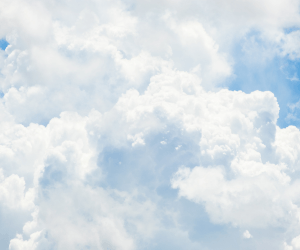
The color picked for the year 2026 is PANTONE 11-4201 Cloud dancer a lofty white shade representing serenity ,calm and fresh start in a chaotic world. This is the first time a white shade has been chosen for the title.

Why Pantone 2026 Is Getting So Much Attention⚠️
Pantone colours usually set trends across:
- Fashion
- Lifestyle
- Home décor
- Beauty
- Branding
But 2026 feels different.
This year’s colour reflects a global shift toward:
- Minimalism
- Calm aesthetics
- “Quiet luxury”
- Comfort over chaos
In a world that feels fast, noisy, and overwhelming, this color sends a clear message:
And that’s exactly why people are talking about it. This year the color came with lots of dissatisfaction ,controversial and troll across the globe but by some it is mentioned as classy ,rich and elegant. what do you think is it wearable in real life? I can show you the potential on this color of the year can be your color. white can never goes out of the trend.
Pantone 2026 in Real Life: Fashion Edition 👗💁♀️
Let’s start with what most of us care about — clothes.
Is Pantone 2026 wearable?🤔💭
Yes — and that’s its biggest strength🦾.
This colour works best in:
- Casual wear🕺💃
- Everyday outfits🧍♀️🧍♂️
- Layered looks💼
- Clean silhouettes🧹
How it looks in real outfits💃🕺
In real life, the Pantone 2026 colour shows up as:
- Soft tops🥼
- Relaxed trousers👖
- Oversized shirts👔
- Knitwear🧣
- Light jackets🧥
It doesn’t scream for attention — it says elegant
Best ways to style it
- Pair it with denim for an effortless look👖
- Combine with black or brown for contrast⬛🟫
- Add gold or silver acessories🥇🥈
- Use texture (cotton, knit, linen) to avoid looking flat
This colour shines when styling is simple.
Pantone 2026 for Everyday People (Not Just Models)
One big fear people have:😨
“Will this colour suit my skin tone?”🤔
The good news?😮💨
Because it’s neutral and soft, it works on most skin tone when styled correctly.
Tips to make it work for you😉
- If you have a warm skin tone → add warm accessories
- If you have a cool skin tone → pair with silver or grey
- If you’re afraid of looking washed out → wear it away from the face (pants, skirts, layers)
Fashion is not about copying — it’s about adapting.
Pantone 2026 in Real Life: Lifestyle & Home 🏡
Now let’s talk lifestyle — because this color isn’t just for clothes. This color is for you if you love classy and elegant vibes. Minimal is the key.
Home décor✨
Pantone 2026 works beautifully in:
- Bedrooms🛏️
- Living rooms 🖼️
- Minimal spaces🪟
- Calm corners🪷
Think:
- Curtains🪟
- Cushion covers
- Bedsheets
- Wall accents🖼️
It makes spaces feel:
- Cleaner🧹
- Brighter🔆
- More peaceful🧘
Perfect for people who love aesthetic but hate clutter.
Pantone 2026 Aesthetic: Social Media & Daily Life 📸
This colour is already dominating:
- Instagram feeds🎞️
- Pinterest boards🎬
- Minimal reels💽
- Lifestyle vlogs💃
Why?
Because it:
- Looks good in natural light☀️
- Feels expensive even when it’s affordable💸
- Matches almost everything🙏
For content creators and bloggers, this color is a dream.
Is Pantone 2026 Boring?🥱 Let’s Be Honest😶
Some people say:
“It’s too plain.”
“It’s just another neutral.”
“Where’s the fun?”
And that’s fair.🤷
Pantone 2026 isn’t for:😏
- Maximalists
- Loud colour lovers
- Statement-only fashion fans
But it is perfect for:🫠
- Minimalists
- Everyday fashion lovers
- People who want timeless style
Not every trend has to be loud to be powerful.🤯
How I Use Pantone 2026 in Real Life
I styled the Pantone 2026 colour in a simple, wearable way:
- One outfit
- Natural lighting
- No heavy filters
- Everyday accessories
The goal wasn’t to impress — it was to show reality.
And that’s the beauty of this colour:
It doesn’t need effort to look good. Less is more.
Final Thoughts: Is Pantone 2026 Worth Following?🏃♂️
If you ask me?☺️
Yes — but only if you style it your way.💅🤌
Pantone 2026 is not about trends that disappear in a month.
It’s about building a wardrobe and lifestyle that feels:
- Calm
- Clean
- Confident
You don’t need to replace everything you own.
Just add touches, experiment, and make it personal.
Because the best trend is the one that fits your real life👑.